Kaleido — Clarifying Blockchain Infrastructure Through a Focused Hero
Visual Design — Homepage Hero Exploration
Overview
This project is a design refresh of the Kaleido.io homepage hero, created as part of a visual design panel presentation. The work stands on its own as an example of strategic visual thinking applied to complex technical products.
The hero section of a website is often the first—and sometimes only—touchpoint visitors engage with. This redesign treats the hero as the most critical moment to clearly communicate Kaleido’s value, establish trust, and drive action.
Rationale
Not every visitor scrolls. Some never make it past the fold.
This makes the hero a high‑impact space where clarity, hierarchy, and trust must work together immediately. The goal was not a full rebrand, but a measured, non‑jarring refresh—one that could be rolled out incrementally, starting with the homepage hero section and scaling across the site over time.
A full web refresh would follow later, once a new direction is established and validated.
The Objective
Redesign the Kaleido homepage hero:
- Clearly communicate what Kaleido does
- Balance credibility for developers with accessibility for business stakeholders
- Simplify complex blockchain concepts through clear hierarchy and language
- Drive meaningful actions such as “Start building free” and “Talk to an expert”
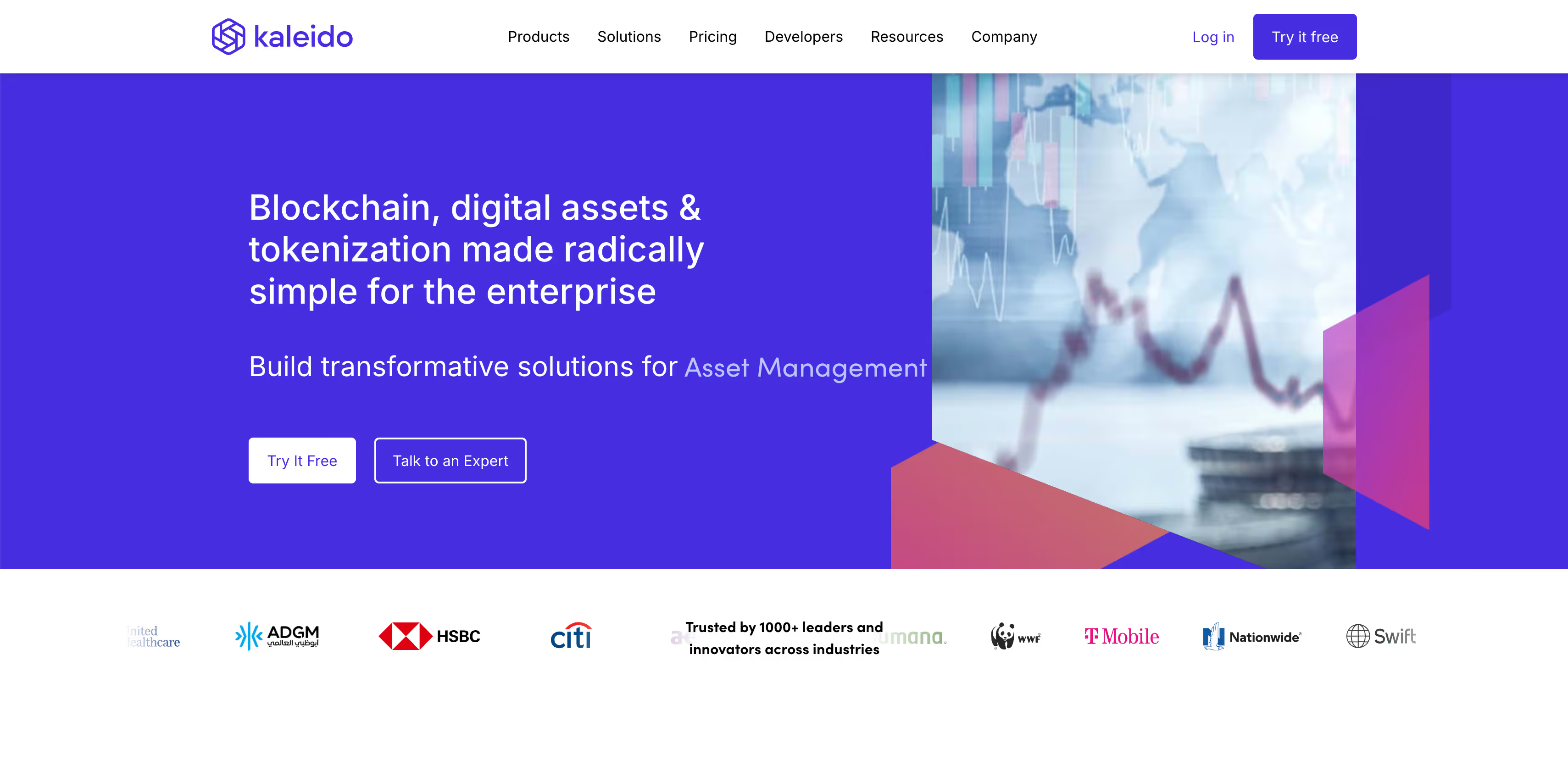
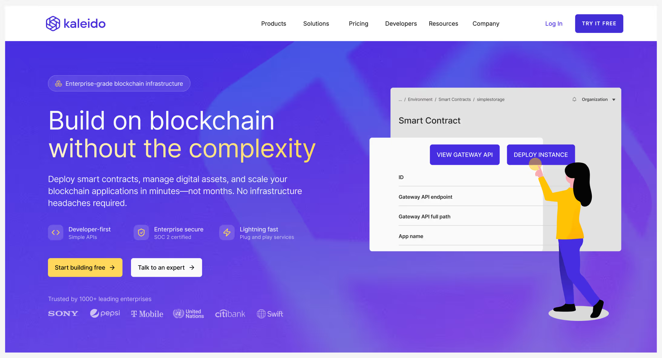
Original Kaleido hero section
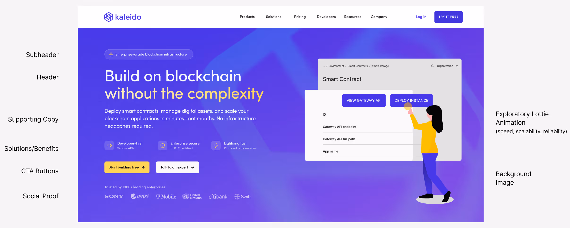
Hero Layout Breakdown
- Subhead/Header: Designed to state what Kaleido does and why it matters in one glance, the core value proposition (H1 tag)
- Supporting Copy: Short, plain-language summary that simplifies complex language for accessibility without sacrificing credibility
- Solutions/Benefits: Three value points, each paired with a custom icon. Positioned to bridge the gap between the abstract value proposition and the tangible benefits of the product—Bullet-style formatting for scannability, reducing cognitive load
- Primary CTA: “Start building free” used instead of “Try it free” to reinforce the idea of building on blockchain—the yellow CTA button has strong contrast for maximum visibility and to drive click-through
- Secondary CTA: “Talk to an expert” speaks to both dev and stakeholder audience (alt option “View documentation”)
- Social Proof: A short row of trusted enterprise logos for instant credibility—reduced opacity and scale to not compete with the main message and CTA
- Lottie Animation: A conceptual motion graphic that introduces simplified yet familiar UI/illustrations seen on product that hint at ease of use, speed, and reliability. Serves as an engaging focal point while aligning with the supporting copy
- Background System: A scalable background treatment using the Kaleido brandmark to add depth and texture. Designed to extend across headers, blog thumbnails, and social touchpoints
Lottie Animation
The Lottie animation is intentionally simplified, based on familiar UI patterns from the product platform. It communicates speed, reliability, and ease of use without overwhelming the message. This asset is designed to scale beyond the homepage and be reused across social media, presentations, and other marketing touchpoints.
Brand & System Considerations
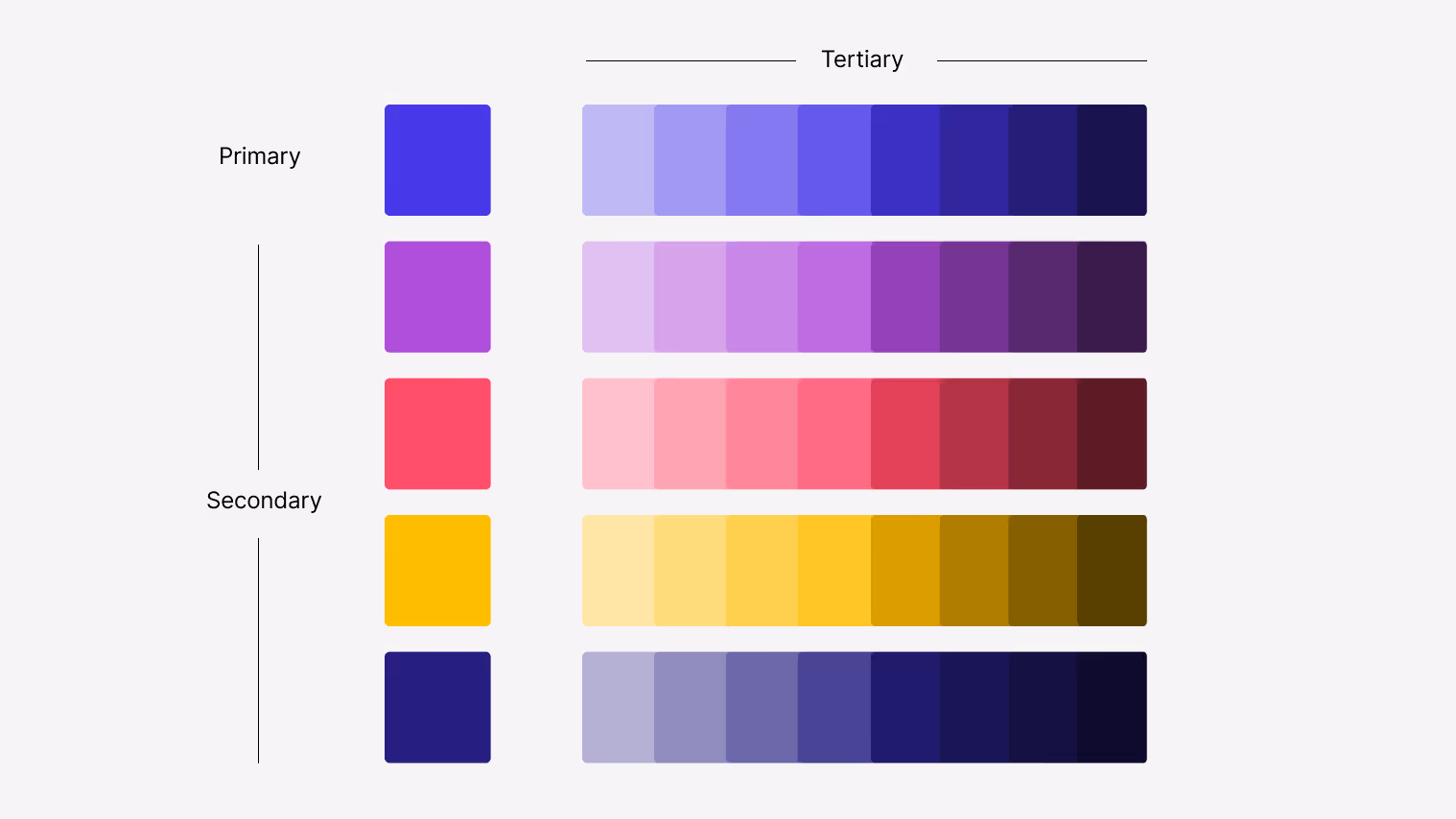
Iconography & Color System
Testing revealed accessibility and contrast issues within the existing palette, particularly secondary colors placed on primary backgrounds.
Recommendation:
- Introduce tertiary colors to improve contrast and accessibility
- Use color layering to create a more modern, flexible visual system
- Maintain consistency with the existing brand palette while expanding usability
Typography
The hero concept uses Kaleido’s existing brand typeface, Sofia Pro, with reduced weight to improve readability and visual balance.
As a broader system recommendation, Inter was explored as a potential sitewide alternative. Inter is already used across product interfaces and user‑facing communications, making it a strong candidate for unifying marketing, product, and brand experiences during this initial refresh.
Why Inter:
- Cleaner, softer tone while remaining professional
- Improved readability in dense layouts
- Letterforms—particularly the “a”—align more naturally with the Kaleido wordmark
Introduce tertiary colors
Scalable background image

Typography unification example
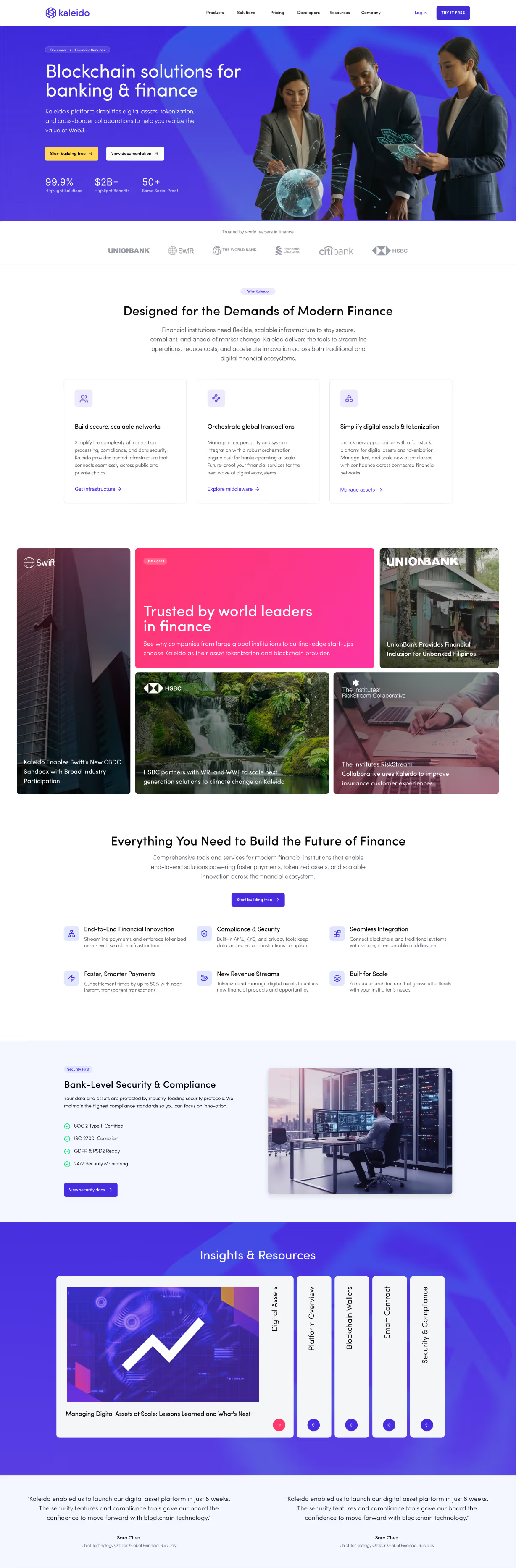
Scaled Example: Financial Services Page
To demonstrate how the hero system could extend beyond the homepage, a quick exploratory refresh of the Financial Services page was created using the same layout principles.
This example shows how the design direction can scale across additional pages while maintaining clarity, consistency, and brand cohesion.
Original page: kaleido.io/industries/banking-and-finance Overall Outcome
This concept illustrates how a focused hero redesign—supported by thoughtful typography, motion, and system‑level thinking—can significantly improve clarity, trust, and engagement for a complex technical platform.
While created for a particular setting, the work reflects real‑world constraints, scalability considerations, and a strategic approach to evolving an existing brand rather than reinventing it.