Process
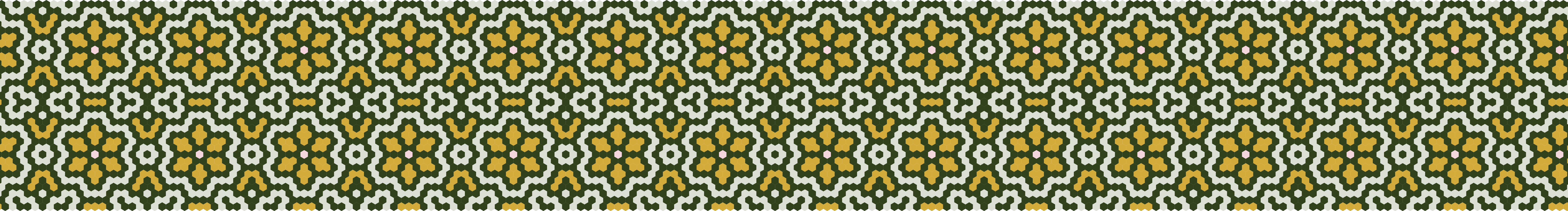
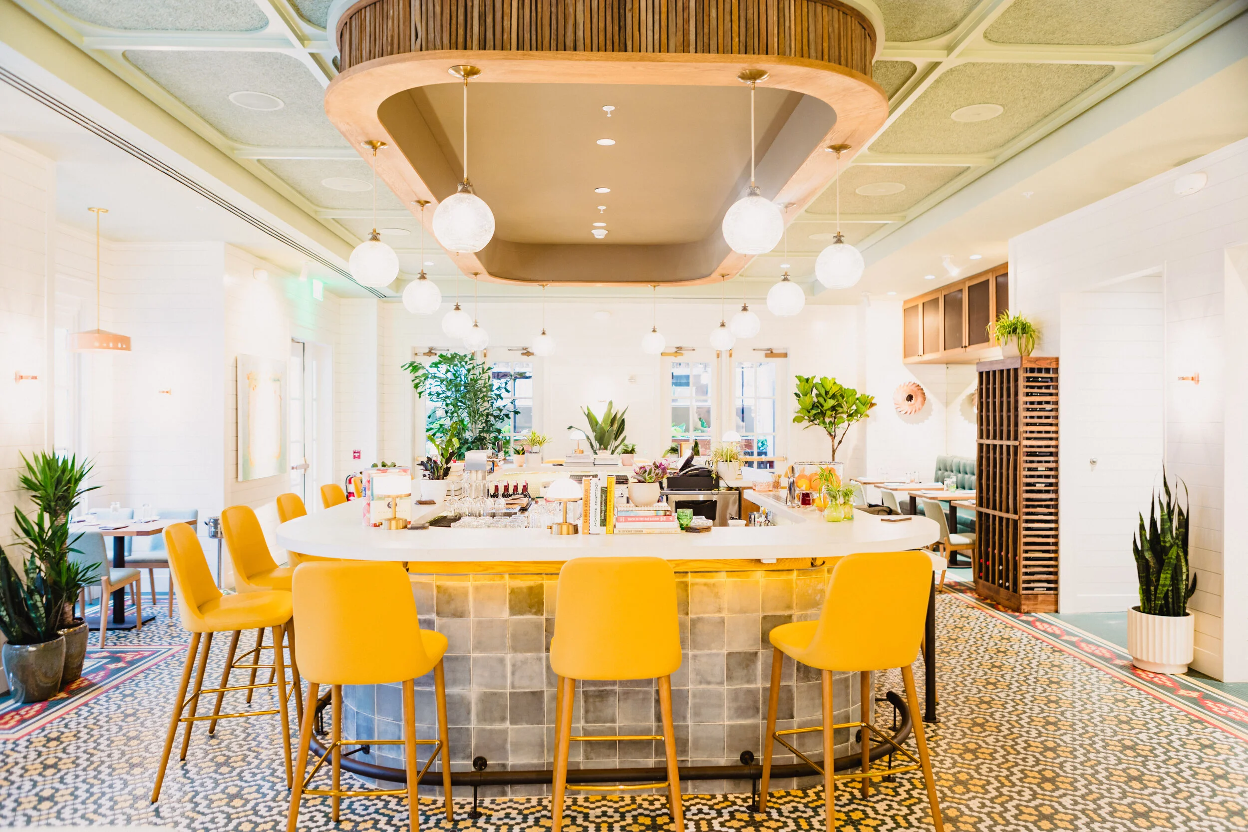
In approaching the design for Lenoir, I began with an understanding of Vivian's story and dove into researching the two places Vivian would fuse for her next restaurant: Lenoir County, NC, and the South’s mecca of fine dining, Charleston, SC. In working with Vivian and her architectural designer, it was apparent that Lenoir’s branding would be best suited as layered and nuanced as the food she would be serving. I drew inspiration for the color palette and tobacco leaf iconography from a photograph taken on a farm in eastern North Carolina. The clean aesthetic of fine dining, juxtaposed with the textural elements of tobacco farms indicative of Lenoir County, were the anchoring concepts of my typeface, pattern, and menu design choices. From tobacco sticks and butterbean pans to punchy patterns and bright colors, the design elements of Lenoir are inviting and symbolic of the experience you're guaranteed when dining there.